Should you find yourself gazing upon the new Los Padres ForestWatch logo, you might find yourself transported to an unmistakably idyllic vantage point within the Los Padres National Forest. Bursting from within the massive outstretched wings of a soaring California condor, the logo’s interior reveals a vibrant band of golden sky, a subtle ribbon of ocean, folds of purple mountains and rolling green hills, and verdant chaparral in the foreground. At first glance, it just might come off as a California dream—but the message behind this new logo goes far beyond a bodacious beauty shot.
Our logo has evolved along with our organization over the past 17 years, and today we’re thrilled to open this new chapter as we forge ahead with our vision of protecting public lands throughout our region.
Jeff Kuyper, Executive Director
The new ForestWatch logo aspires to capture Los Padres National Forest at its best, an idealized version of this vast and multi-faceted expanse of California. In other words, it is designed to resemble what one might want every inch of this landscape to be, or perhaps how one might want it to stay. But as anyone who is familiar with ForestWatch’s work can attest, driving change to protect this land doesn’t happen on its own. And not every patch of Los Padres National Forest is in such a pristine state—which is precisely where the soaring silhouette of the condor comes in.
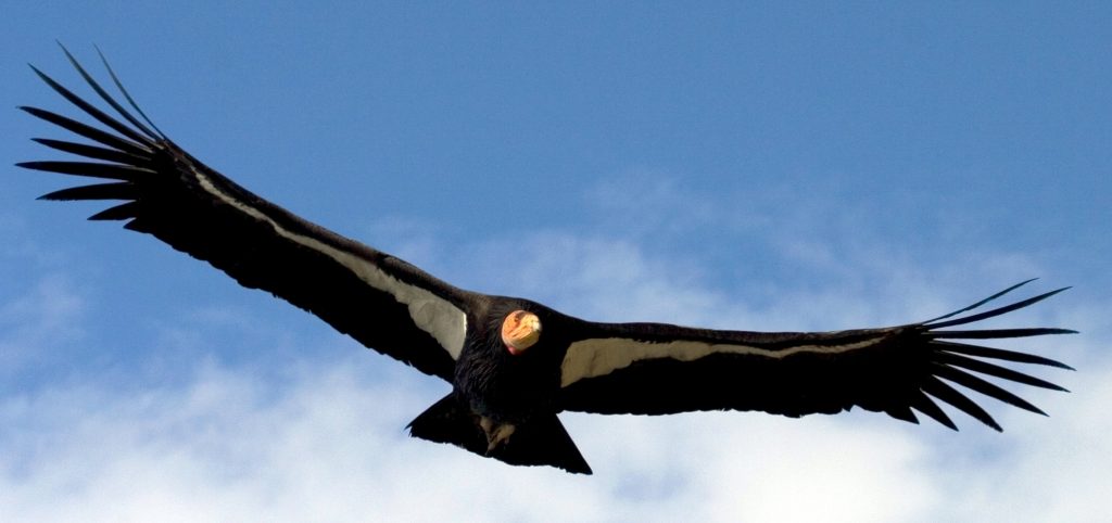
With a wingspan that extends more than nine feet, the California condor is the largest flying bird in North America. There was a time, back in the 1980s, when this bird was under serious threat of extinction with fewer than ten known condors living in the wild. Today there are more than 300 free-flying condors with many of them soaring over the Los Padres National Forest. While they remain critically endangered, the return of the California condor is counted among the great stories of environmental conservation of our time, so it only seems fitting that this iconic bird fit prominently into the design of the new ForestWatch logo.
The work of ForestWatch is, of course, not to the exclusive benefit of the condor. The Los Padres National Forest contains some of the best habitat for condors, and a number of ForestWatch programs help reduce the threats to the bird including the prevention of lead poisoning, shooting, microtrash ingestion, and collisions with power lines.
But the efforts of ForestWatch go further. Protection from drilling, prevention of commercial logging, safeguarding wildlife, and preserving public access are among the accomplishments of Los Padres ForestWatch since its establishment. This needed to be captured within the spirit of this new logo, not to mention the mission of ForestWatch.
“The condor is just this magnificent story of conservation,” says Ventura County-based Carol Gravelle, who designed the new ForestWatch logo and enjoys hiking near a condor observation point on 8,800-foot Mount Pinos within Los Padres National Forest. “I thought that would be the perfect emblem, but then I thought ‘ForestWatch is not just about condors. It needs to have a combination of the landscape.'”
That’s what led to the abstract landscape within the outline of the condor. “I thought an ‘abstract’ that included the ocean, that included the foothills, that included the physical terrain of the Los Padres National Forest could work. The condor itself is overseeing the landscape so that’s the personification of what ForestWatch is all about.”
Gravelle, it turns out, was not alone in her thinking.
“The condor is such a strong symbol of protection. To me the bird with its wings wide looks like it is soaring over the forest and watching over the land,” said Anna DeLaski, board vice president of ForestWatch who was on the committee to approve the final logo design. “It represents our mission so well: we protect water, wildlife, wilderness and sustainable access for our communities throughout the Los Padres National Forest.”
“Watchful.” “Protective.” “Warm.” “Resolute.” “Inclusive.” These were some of the adjectives that a small group of ForestWatch board members agreed should be used to describe the new logo, whatever shape it took. And once the team had winnowed down the logo options from six to two, all designed by Gravelle, they asked a small group of stakeholders for their input.
Most gravitated towards the condor.
“The condor soaring shows protectiveness, a watchful bird’s eye view,” said one individual.
“Emblematic of the region,” said another.
“It sends a message that the wings are protecting all that’s below…which is what ForestWatch does,” said another.
When it comes to logos, it has been said that they should be more than just an “identifier” but also serve as a “stand-in for you who you are.” In the case of the Los Padres ForestWatch logo, this stand-in is found in places and things all around us. It might be affixed to the water bottle of a teenager. It could be slapped onto the rear bumper of a vehicle riding through Santa Barbara. It could adorn the t-shirt of a coffee shop lounger in Ventura, or on the hat of a trail runner in San Luis Obispo. And, of course, it shows up on the organization’s website, social media channels, newsletters, large event banners, and information booths.
“To design an effective logo you really have to distill an organization down to its essence,” says Gravelle, who has been with ForestWatch for more than 15 years and happens to have designed the previous ForestWatch logo after responding to a craigslist post. “Simple is better. Cleaner is better. But clean and boring? That won’t work. It has to spark interest. It has to make them want to know more. The essence has to come through—without a lot of thought.”
In many ways, Gravelle, who has done design work for organizations large and small—and has a body of design work with a decidedly environmental bent—was an ideal choice to design the new ForestWatch logo. Not only does she believe in the mission, she also has a firm grasp of what ForestWatch can achieve and how it makes things happen.
“ForestWatch is a lean and very effective organization,” notes Gravelle who offered up her design expertise free of charge because of her commitment to the organization. “They are on top of the people who want to do things to public lands that they shouldn’t.” She also observes that, as a member, “it really feels like you are contributing to the direct result of things.”
An effective logo should also inspire people to feel something and perhaps even motivate them to action—inside and out of the organization. The new logo, according to Kuyper and team, nails it.
“The California condor is an iconic symbol of wilderness and its skillful determination, watchful eye, and steady wingspan are pillars of our work. Its story of hope and resilience inspires us, exemplifying the importance of our region’s public lands and the need to protect them.”


Comments are closed.